
01
House information
Design | Design : Tianyong Design
Address | Address: Hopewell New Town
Area | Area: 76 m²
Style | Style: retro simple beauty style
Photography | Film : Star.
The residents of this residential design project are the owner + parents. They like a variety of styles and hope that the overall style is concise and generous, with a sense of design and a certain color combination. Within a limited budget, the fixed building finishes and facilities are expected to be simple and attractive, with an overall design effect, and can be mixed and matched. Sufficient storage space is required.
Considering that the owner is relatively receptive and prefers personalized design expression, the design team provides more picture choices to try to capture the owner's deepest preferences instead of being limited to simple and straightforward style expressions.
Finally, what made us agree is: retro mix and match style. The main color is blue, which depicts a beautiful and durable home.
"Blue is as far away as the sky and mountains. We always love blue and think in blue, because blue pulls us and makes us yearn for it."
02
House renovation

▲Floor Layout
In general, the changes in the layout are not too big. On the one hand, the division of the original space is sufficient to meet the needs of the residents, and on the other hand, it is a consideration of the comprehensive budget.
The design team optimized some circulation lines and modified some walls to make the circulation lines smoother and improve the living experience.
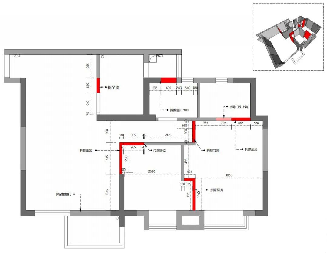

(Swipe left and right to view the wall demolition plan and wall construction plan)
▲Remodeled house plan
Key points of transformation:
①The main bathroom is changed to the second bedroom 1. Although the original space was square, it was small and there was almost no room for anything else after putting down the bed. After the renovation, part of the space was borrowed from the master bedroom. The walls were flush with the walkway, and three pieces of furniture could be placed in the room.
②Adjust the layout of second bedroom 2. The wardrobe in the second bedroom 2 was changed from the wall embedded in the master bedroom to the TV background wall. This was decided according to the different needs of the residents for storing clothing. The master bedroom has added storage space.
③Open the kitchen door. The kitchen door is enlarged, lighting and views are expanded, and the sense of interaction between family members is increased.
④Reroute the living balcony. The living balcony was originally entered from the kitchen, but was changed from the bathroom. First, the kitchen can cancel the aisle function to make a U-shaped kitchen with high utilization rate; second, it can rationally utilize the aisle formed by the double separation of the bathroom.
03
Space display

The living room has quite a sense of extension, and different colors blend well into one space. The blue color of the background wall is like the sky at dusk, which is calming and makes people love it.

Rendering of matching living room furniture and decorative furnishings▲
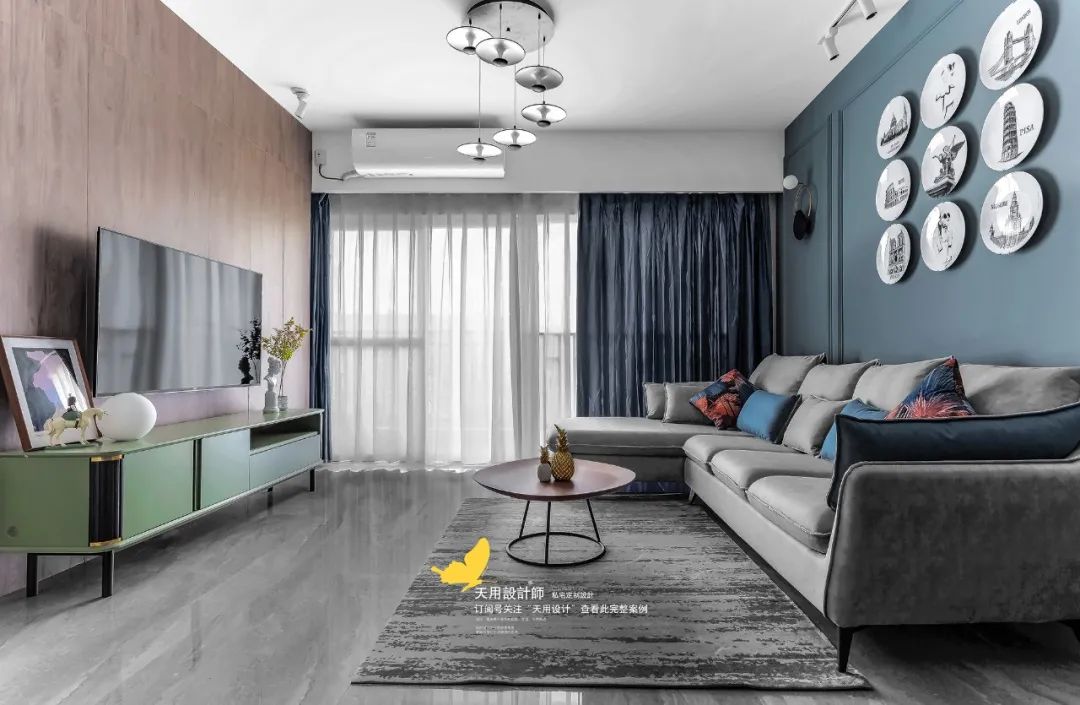

In terms of color matching, the gray blue wall color + light gray sofa + light green finished cabinets form the same cool tone, making the entire space calm and restrained, forming a mix of retro and simple beauty.
The shape of the background wall is a combination of wall paint + wooden moldings. The budget is lower than that of wainscoting, and the effect is also very good.


The TV background wall is half made of wood veneer and half is made of custom cabinets. The same texture gives the background wall an overall effect, hiding the sense of volume well and making the space feel more comfortable.
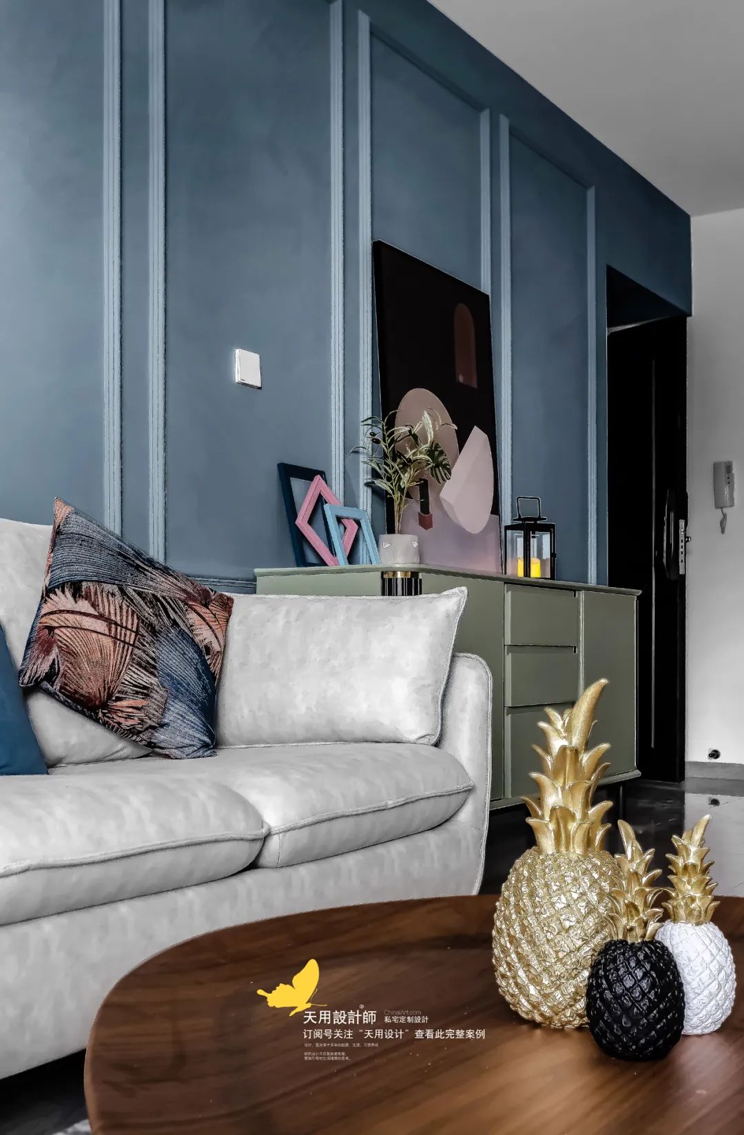


Porch & restaurant indoor furniture and decorative furnishings matching renderings▲

The dining table and chairs have a strong sense of lines. The combination of brown, red and black fits the style and tone of the space.
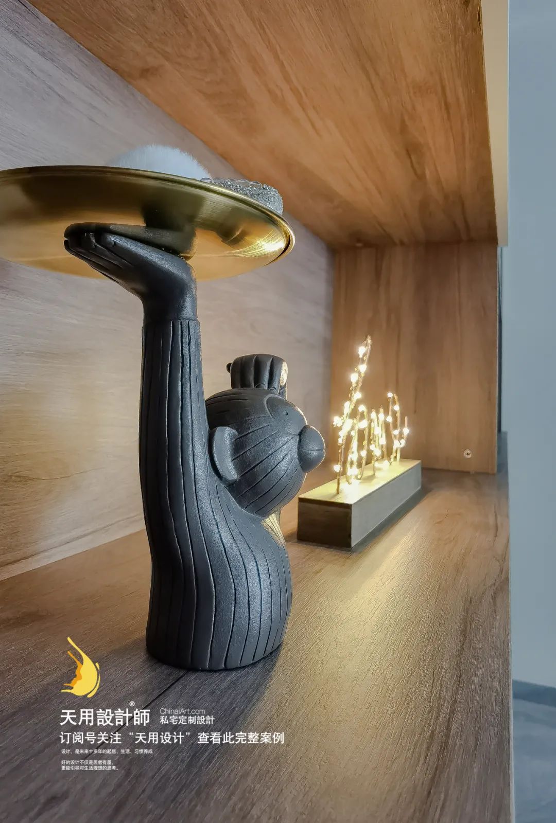
The owner himself collects many unique ornaments, and the storage cabinets on both sides have the functions of storage and display.

Place exquisite vases and bright flowers on the dining table to show the ritual sense of life.

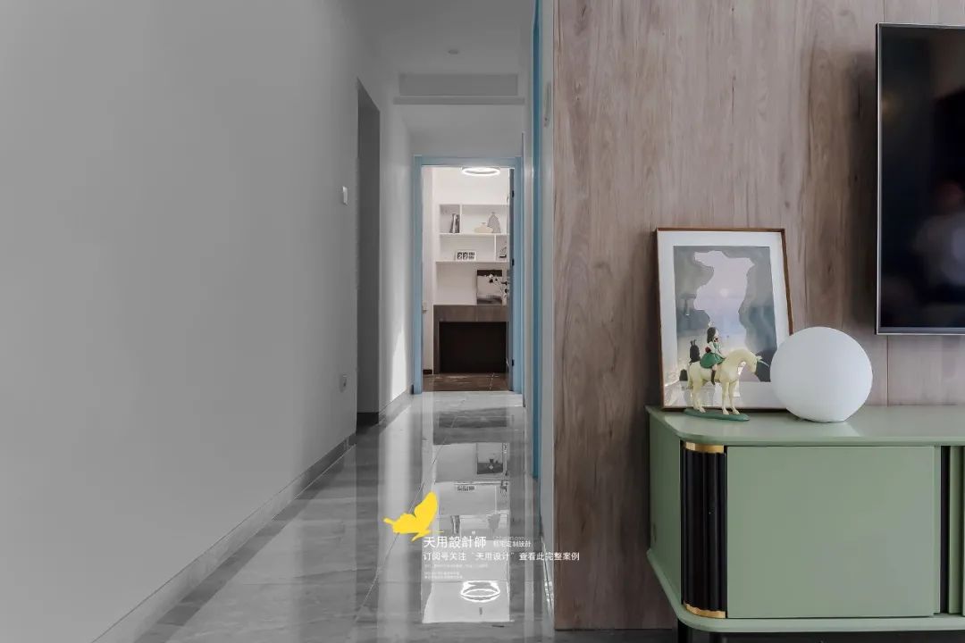
Aisles and public areas are covered with gray marble tiles, which have a natural texture, are stain-resistant, and are simple and elegant.
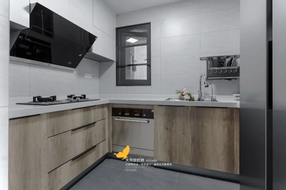
After the entrance to the living balcony was changed from the kitchen to the bathroom, the kitchen changed from the original split two-stage layout to a U-shaped layout. The area of the workbench became larger and the space utilization rate was improved. Even if the space area is the same, the usage experience of the U-shaped layout will be better.

Rendering of matching furniture and decorations in the master bedroom▲
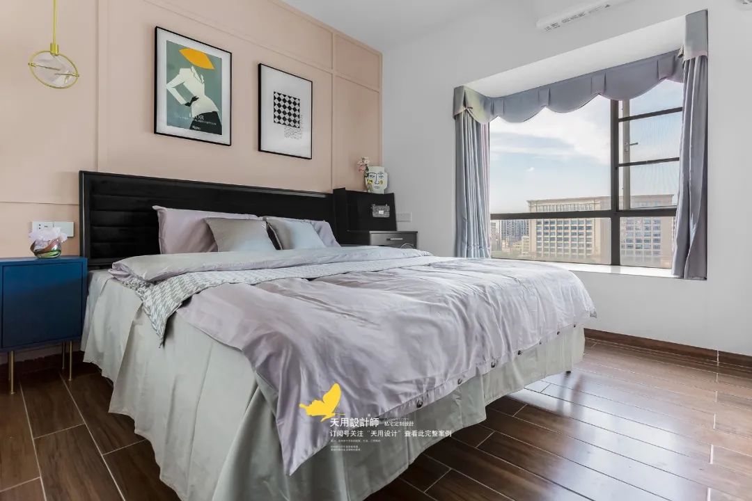
The master bedroom uses pink-gray as the background wall color, soft gray bedding and classic blue bedside tables as the color scheme. It is overall comfortable and has a refreshing girly feel, creating a warm and quiet atmosphere suitable for sleeping.

My sister has a lot of bottles and cans, so she chose a dressing table type with more storage space and more flexible storage methods.
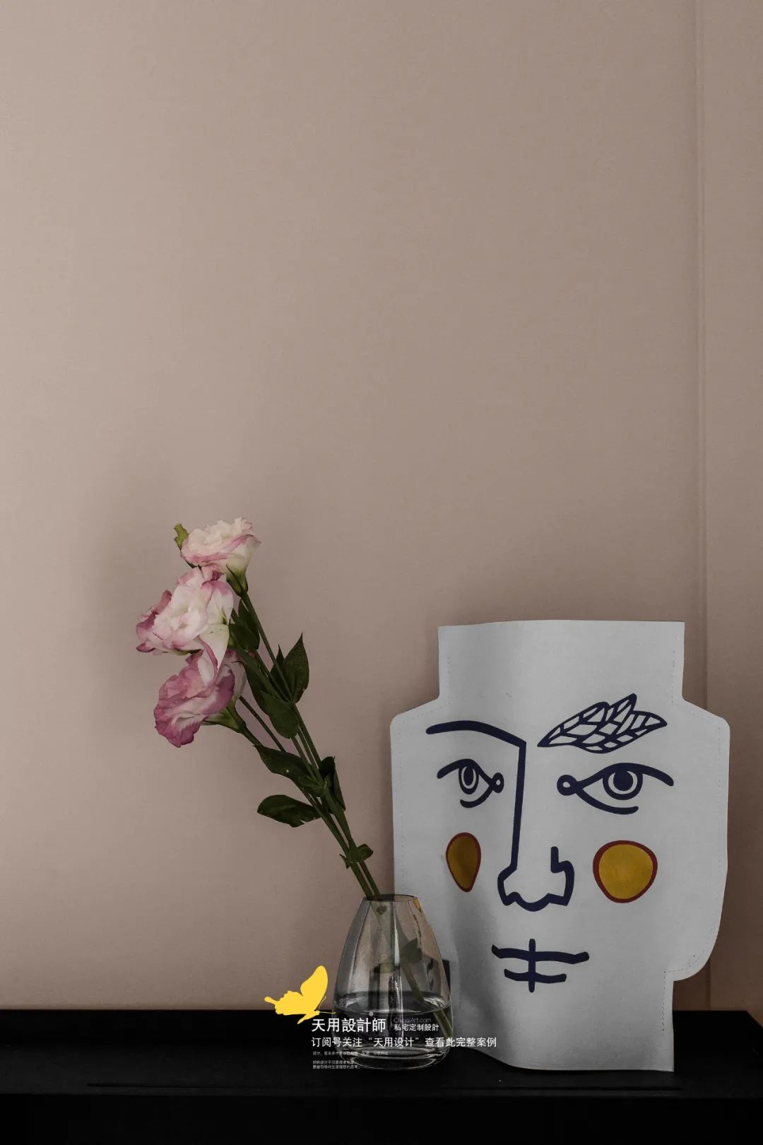
Pink carnations bloom quietly on the gray-pink background wall, forming a sharp contrast with the personalized vase ornaments on the side.

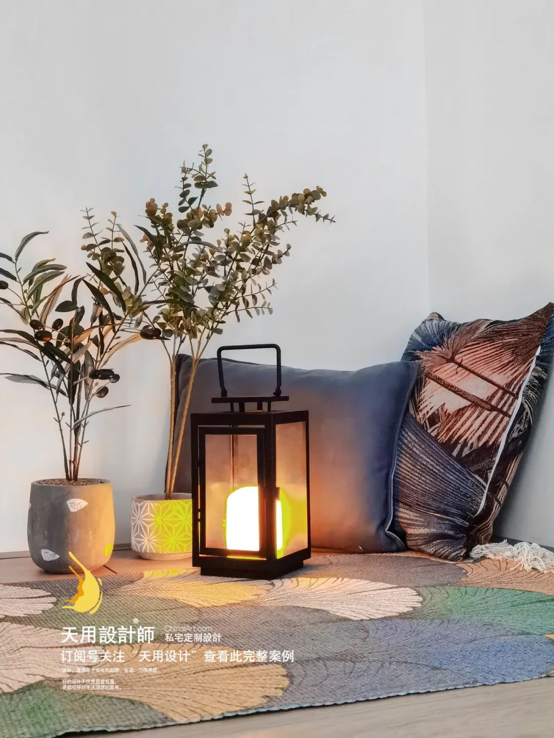
The main bathroom has been transformed into a multi-functional room. You can take a nap on a mattress or bay window cushion in front of it. The tatami mats stored on the sides and the large cabinets that stand on the floor meet the owner's storage needs.

The bathroom has a double-separated design, making it convenient to wash and wash at the same time during peak periods. The aisle between the wash area and shower area leads to the living balcony.