House information
Design | Design: Tianyong Design
Address | Address: Huangpu Garden
Area | Area: 93 m²
Style | Style: modern simple style
Photography | Film: Star.
01
Every set of designs, whenever possible, we hope to shoot by ourselves, because we feel that what the hand-held camera can see through should be the area that resonates most with the owner and the designer, and try to express the atmosphere of life that we discussed together as much as possible. For design, we expect that taste and aesthetics will always be online and we are willing to believe in the value of design. The owner talked to several design teams in the early stage and finally chose us as the designer. The communication and cooperation process were quite pleasant.
It is often said that the collision of reason and emotion can produce better works. The communication between the owner couple, who are science students, and the Tianyong Design team of sensual aesthetics seems to prove that this statement is not unreasonable.
Rational expression makes it easier for designers to refine the needs of owners. The aesthetic ideas that designers have cultivated over the years have also received considerable recognition.
Tianyong has been in operation for ten years and has done hundreds of cases. The house is always fixed but the needs are ever-changing. In similar apartment types, we take the needs and aesthetics of the owners as the target, and use the professional perspective of designers to present unique and tailor-made styles and effects.
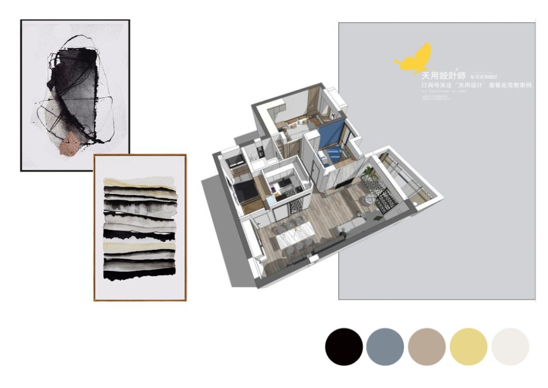
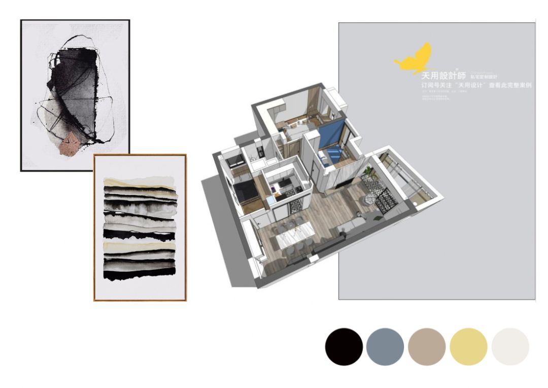
The owner’s home decoration style prefers the Nordic modern minimalist style, which is transparent, sunny, clean, concise, with smooth lines and without too many heavy decorations. Choose a light color scheme, with a larger proportion of black and white wood, giving the space a light and poetic effect.

Illustration of demolishing a wall▲ (blue is the demolished part, red is the new part)
For wall renovation, the Tianyong team’s consistent principle is: put needs first. How to make it more convenient to use and what kind of layout makes space utilization more efficient, we will adopt what method to design and transform.
This residential design apartment renovation mainly explains the following three points in detail:
1. Replace the kitchen and second bedroom, and move the bedroom from the darkroom to a location with natural light. The original kitchen is "I" shaped, which has greater disadvantages in terms of movement and use than the "U" shaped one. The movement of the wall allows the second bedroom to be embedded in the cabinet to meet sleeping needs and storage functions.
2. The corner connected to the living room is made into a cut-off angle, so that children and the elderly at home can reduce the chance of collision and the viewing angle is softer.
3. Some functions of the bathroom are external. The sink and lockers are outside to reduce water vapor contamination without affecting the convenience of use.
02
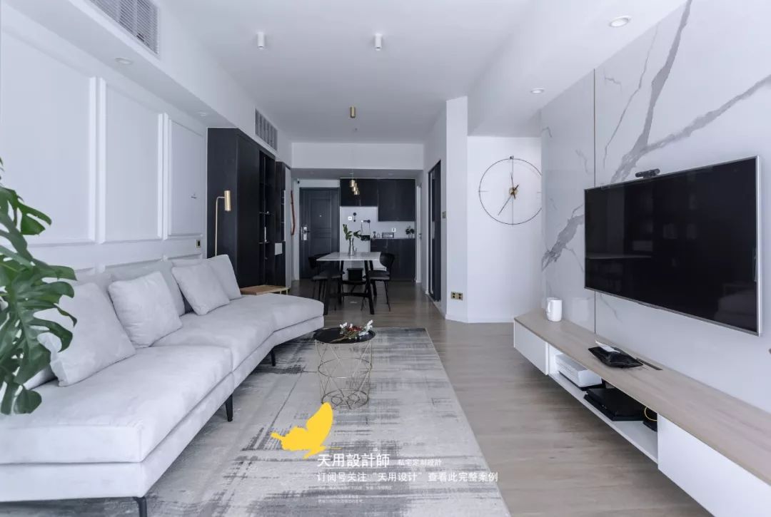

The public area is overall upright and peaceful, with harmonious colors. This set of cases pays great attention to balance. In the design, ensure the nature and individuality of the space and avoid stereotyped style impressions.
What proportion and arrangement of black, white and gray can make the space look more comfortable and live in more comfortable? This is a proposition we have been pursuing and researching.

Entrance area
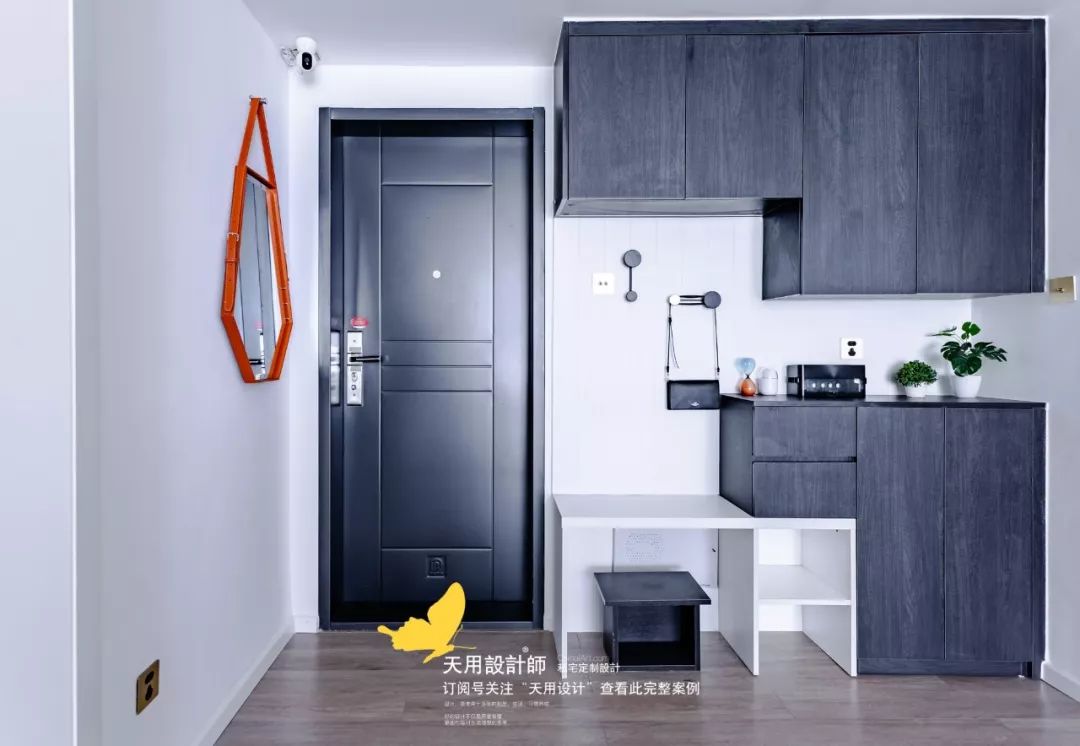
The entrance area has no specific division and blocking function, and you can see the mountain immediately after opening the door. New wall stacks are used to embed the entrance cabinet in the single-sided concave wall area to reduce part of the volume. The split entrance cabinet makes the overall picture clean and tidy, with obvious black and white contrast.
Dining area
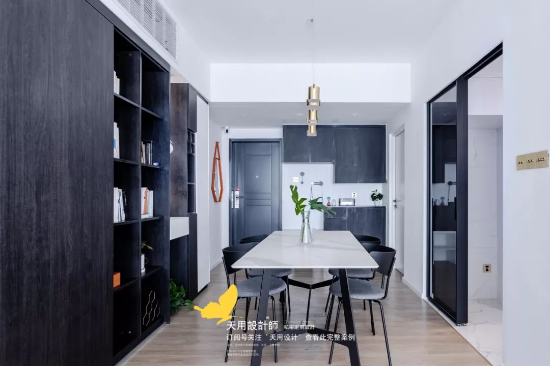


The dining area is located in the middle of the room, which is in line with usage habits; the passages on both sides are divided and the circulation is smooth. There are bookcases and kitchen on both sides, allowing the dining area to have different functions, such as the extension of the operating table and the use of a desk.
The dining table uses a large piece of natural marble as the tabletop, with natural texture and excellent texture. Occasionally put a bouquet of flowers to make the meal full of ritual.
Living room


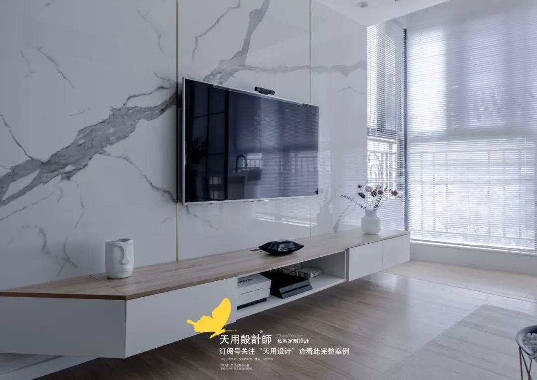
The overall design of the living room follows the idea of "simplicity is beauty, quality is the priority". In the large expanse of pure white, a few natural textures and minimalist lines are added to make the space clean and tidy without losing flexibility; the suede leather sofa with perfect sitting feeling and the wooden floor that is comfortable for bare feet are all bonus points in terms of texture, allowing people to linger in it continuously, and family members to communicate actively.

The rather large Monstera deliciosa was purchased by the owners after shopping in the market. It has lush branches and leaves and is full of vitality.

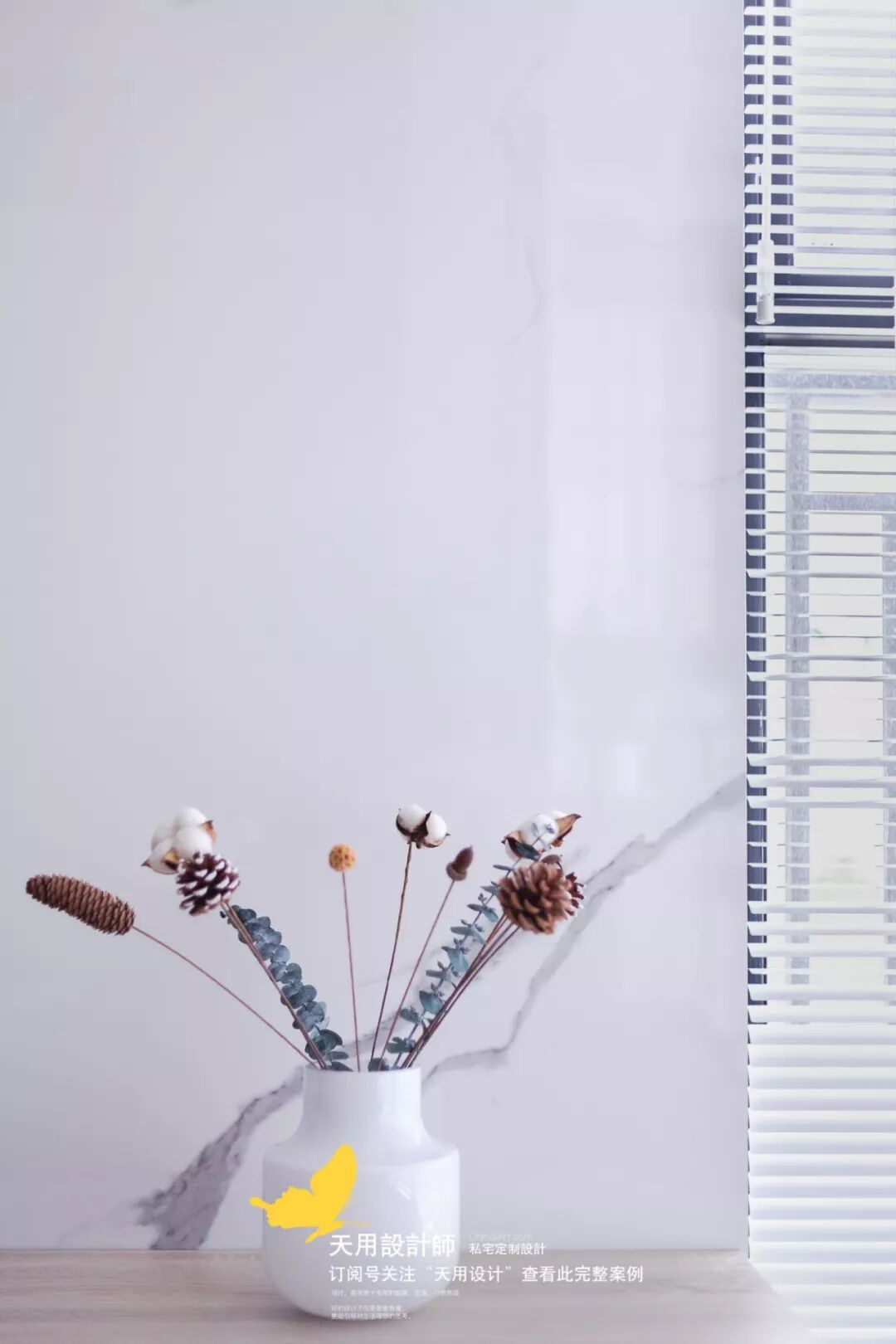
Occasionally, I want to express a literary style. Dried flowers and pure white vases create an ethereal and clean atmosphere to purify the mind.
Cooking Area


The kitchen uses a black transparent sliding door as a partition, which has a certain effect of blocking the line of sight and echoes the black elements in the interior.

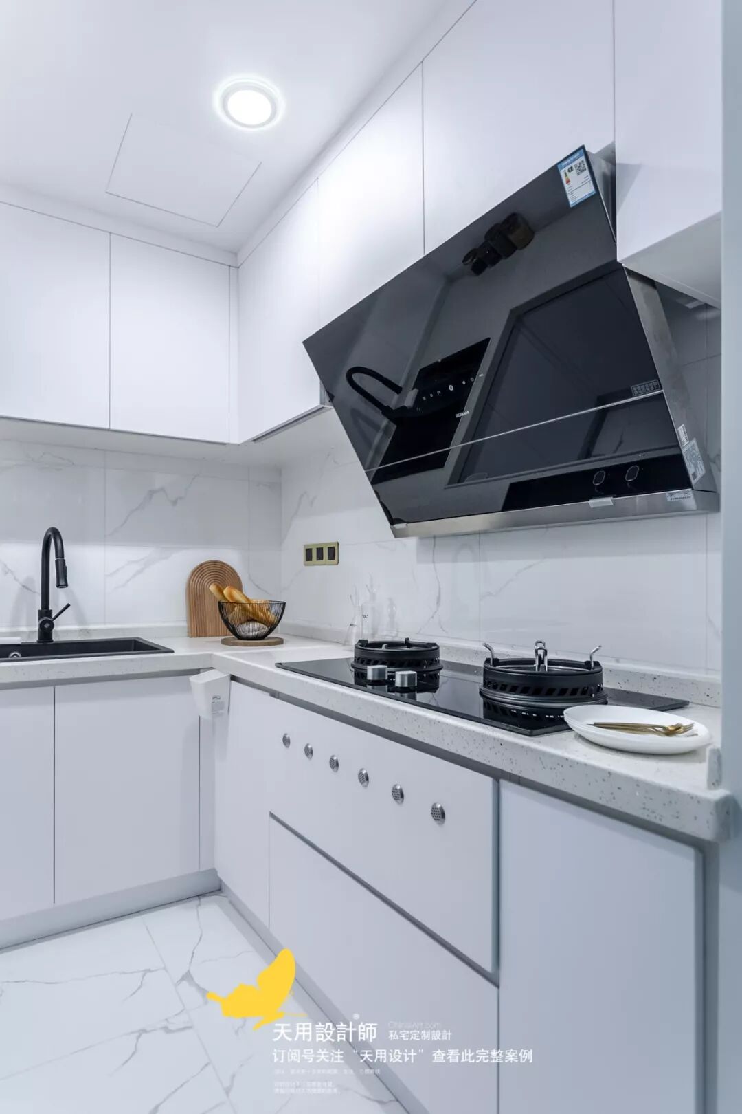
The U-shaped operating table is easy to use and has extremely high space utilization in a small area.
Living balcony

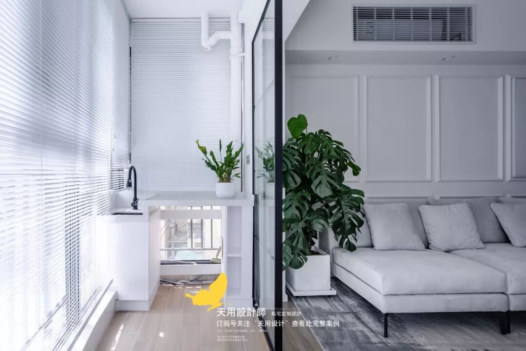
The light passes through the Shangri-La curtains, and the shadows shine softly into the home, and a fairy spirit arises spontaneously in the hazy atmosphere.
Local area


The bookcases against the wall are designed in different lengths and widths according to the needs. The old and new books filled with them show the interests and hobbies of the residents, creating a reading atmosphere with a strong book flavor.
The cabinets in the public area use the same color and texture. They are open and closed, which is a compromise between vision and practicality.
In order to leave a small window for lighting, a simple small table was built between the cabinets on both sides, where you can quietly think, read, etc.
03
Elderly Room


The second bedroom was changed from the darkroom to the original kitchen. Light flows into the room from the window, and the wooden floor is spread into the room, showing a harmonious unity. The large area of light colors makes the room feel good to use even though it is not large, and it does not look cramped.

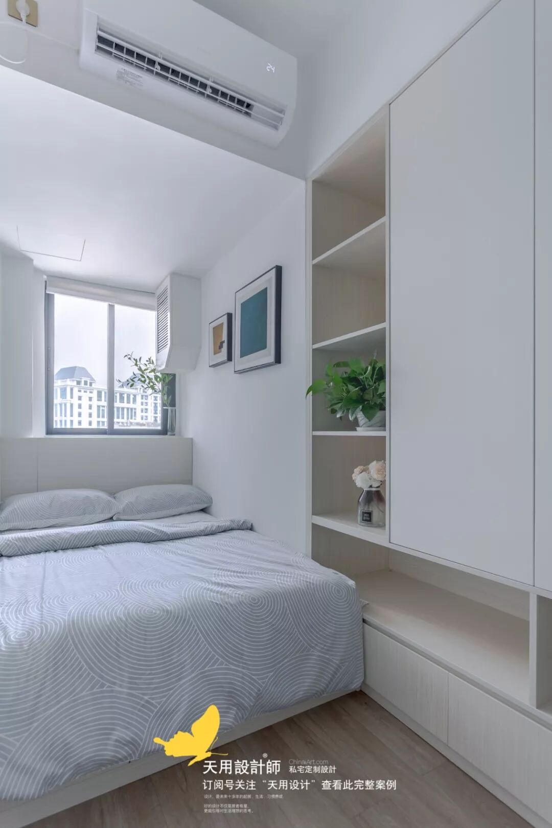
The large bed is embedded in the entire passage, giving residents a solid sense of security; the wall on the right is moved outward to match the size of the cabinet, and the bed area is an open cabinet, which is convenient and safe, and there will be no cabinet door collision.
Master bedroom


The master bedroom uses wood and white as the main colors, with a little green and gray added, highlighting and enriching the sense of nature and layering. The plush pillow makes you want to transform into a hibernating bear and enjoy this warm and quiet time.


The wardrobe is an upright design, pure white and embedded in a concave position, consistent with the color of the room, and the sense of volume disappears. The open cabinet in the middle is used for display; there are two symmetrical cabinet doors on both sides.

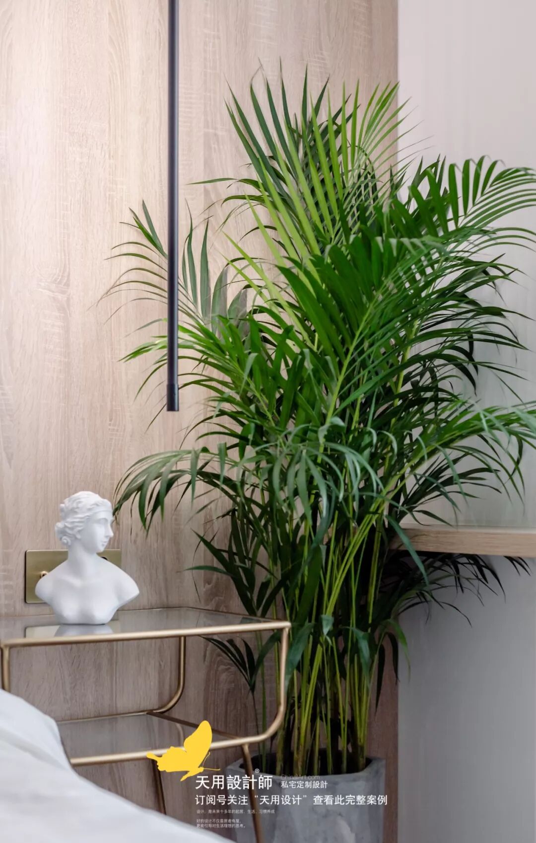
A large green plant is located in the corner of the bedroom. The wood color and green collide with each other, creating a natural and fresh atmosphere. The light, gold-edged transparent bedside table and the minimalist linear chandelier blend into the environment, making them exquisite and beautiful.


The bay window is used as a workspace in the bedroom. As an IT man, the male owner still needs to work from home occasionally. The sunlight and natural wood meet, and sitting on a comfortable chair, it seems that work is not so unacceptable.
Children’s Room


The children’s room uses childlike blue as the main color. A mysterious planet is sailing in the small room, and astronauts are actively exploring the world.

The other half of the children’s room is the study area. Develop the habit of learning from an early age, use rich and interesting books to open up the imaginative world of children, and use books to replace electronic products.
Below the bookcase and bed is a toy storage cabinet. This storage design is arranged according to height size and can train self-care ability.
04
Bathroom area

The sink and storage cabinet are externally located to meet the needs of two people using the bathroom at the same time. The cabinet is not easily corroded by water vapor.
Three-dimensional ceramic tiles are laid in the bathroom area, and the top is covered with pure white and wood colors. It is exquisite and interesting but not too jumpy.
05
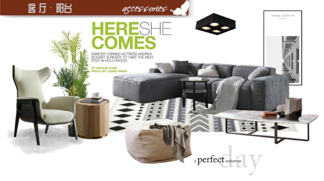
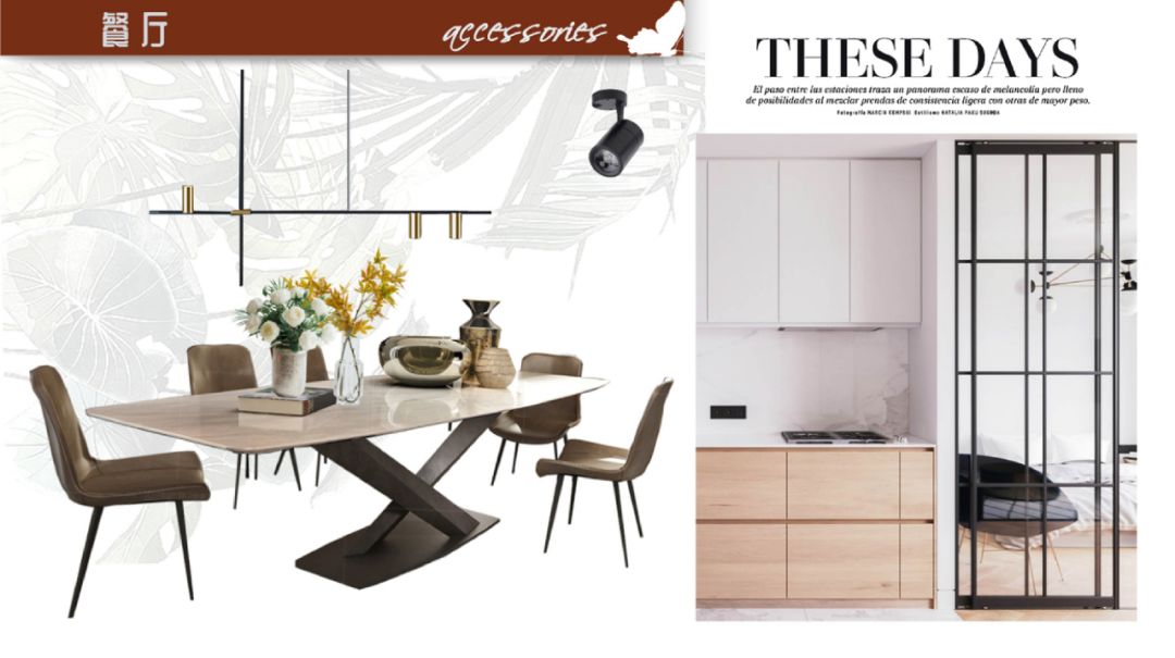
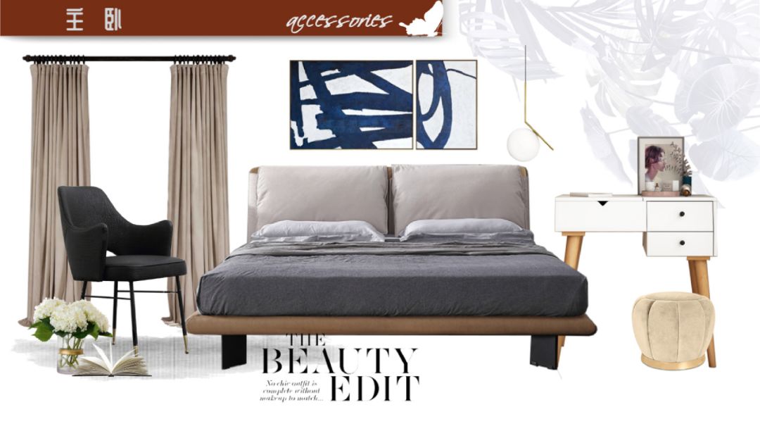
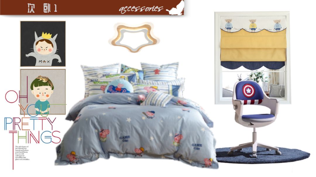
Indoor furniture and decorative furnishings guide sheet

06
House plan
House information
Design | Design: Tianyong Design
Address | Address: Huangpu Garden
Area | Area: 93 m²
Style | Style: modern simple style
Photography | Film: Star.


Initial version▲
(The final version has some modifications, please see the model below for details)


SU model▲
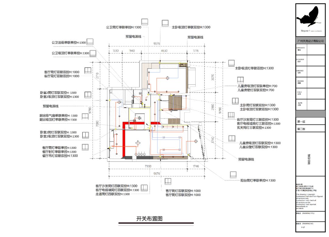
layout partial construction drawings▼