
==Case Information==
Design | Design : Tianyong Design
Address | Address: Foshan Overseas Chinese Town
Style | Style: modern simple style
Area: 140 m²
Photography | Film : Star.
This residential design has a permanent population of four people. The owner of the residence has a high acceptance of beauty and hopes to have a unique aesthetic expression for his or her home. They are willing and good at communicating their own ideas, and they hit it off with the designer on the design direction.
Located in a high-rise location, sunlight passes through the glass and gauze curtains, giving the interior ample light conditions, ensuring superior lighting in every space.
Looking for varied usage methods and expression effects in similar patterns, it is possible to gradually achieve a unity of practicality and beauty in the design process, giving this home a comfortable sense of ritual and a sense of stunning surprise.
==Graphic Design==
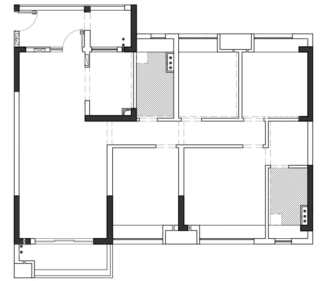
Original structure diagram▲
The original unit layout is four bedrooms and two bathrooms, which can meet the owner's general living needs. Therefore, there are two main functions that need to be modified:
The first is storage. Want to add ample storage space here and there without creating a visual burden.
The second is the expansion of the kitchen. The male owner loves cooking and needs a comfortable dining and kitchen environment.

Wall renovation comparison picture▲
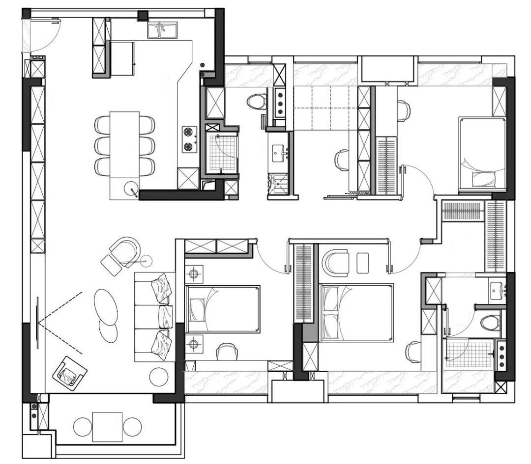
Floor Layout▲
After the renovation, the basic layout of the interior remains unchanged. By demolishing and re-building the walls, recesses are planned and embedded flatly into the cabinets, which functionally meets the storage needs and has complete visual integrity.
The entrance garden was converted into a hallway and kitchen, and the dining and kitchen areas were merged to make the space sparse and open. Structurally, the guest dining and kitchen areas are both as a whole and partially blocked by two walls, creating a sense of spatial transformation, which is unique.
==Space display==

The hexagonal tiles with geometric patterns make the entrance full of personality; the upper part of the entrance cabinet is slightly offset toward the interior, allowing light to shine better.

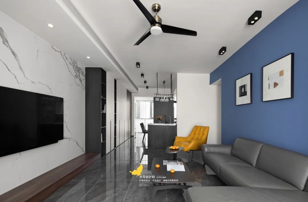
Based on the tone of black, white and gray, the living room boldly uses a large blue color block as the sofa background, and then uses a yellow single chair to balance the color. The contrast is strong, creating a bright and eye-catching atmosphere in the space, which is full of surprise.

The sofa has a simple shape and is versatile, making it comfortable, lazy and relaxing to sit on.


The TV background wall is made of marble with natural and fresh texture and a 150mm high platform. It is simple and elegant, with perfect texture.
The floor-to-ceiling custom cabinet is more than 5m long and extends to the entrance hall, greatly enriching the storage space.
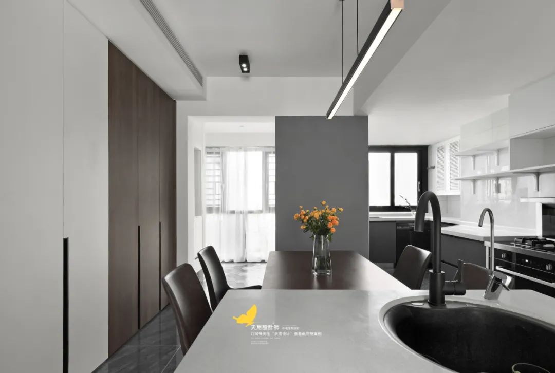
The dining and kitchen area is an integrated design, open and transparent, meeting the needs of the male owner who loves cooking.
The original balcony was merged into the kitchen area, and the long L-shaped design makes the operating table very ample; the dining table is connected to the center island, shortening the movement line, and can also be used as a family activity space.
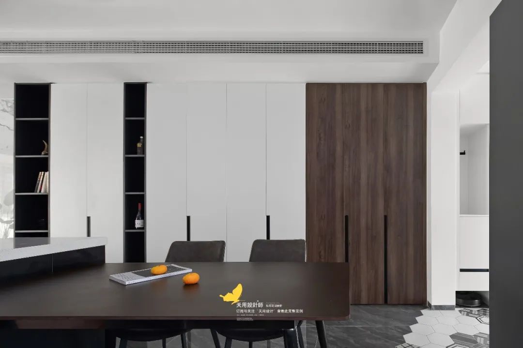
The internal layout of the cabinet is set according to different usage needs. The two rows of open grids can be used as display racks, adding interest to the entire cabinet.

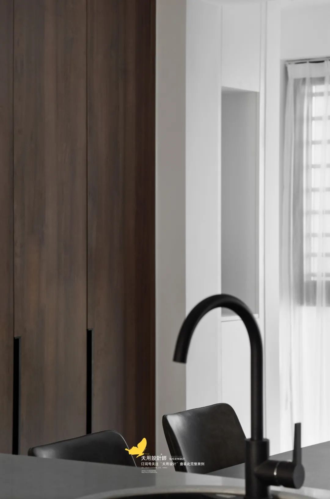
The color scheme of the kitchen is in line with the overall space, harmonious and natural; the lower half of the upper cabinet is an open space, which is convenient for placing commonly used spices and tools, reducing the number of steps to use.

The aisles are paved with ceramic tiles, and the blue and white walls have a strong contrast, which is both refreshing and conflicting.


The master bedroom is designed based on the principle of simplicity, retaining only necessary functions; black and white are used as the background wall, and the light gray bed softens the living atmosphere and creates a comfortable and peaceful sleeping space.

The days are so ordinary, but there are small things, such as the sun's broken rays, shining on it.

The second bedroom is my brother’s room. Because of the need for growth, more emphasis is placed on learning and resting spaces in the design. Use the bay window to create a desk with a spacious countertop, and open three-dimensional storage designs on both sides to improve space utilization.
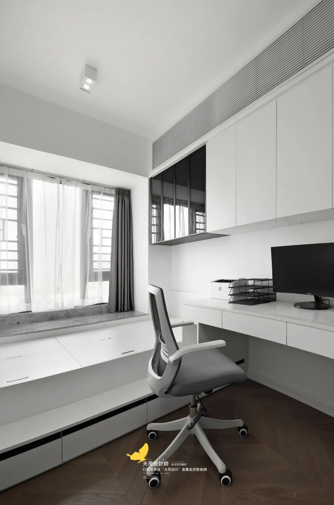
The study room is designed with tatami mats, which increases storage space, so you can rest nearby when you are tired.
The tatami is higher than the bay window. After the mats are laid, the usable area is increased, presenting an overall design expression.

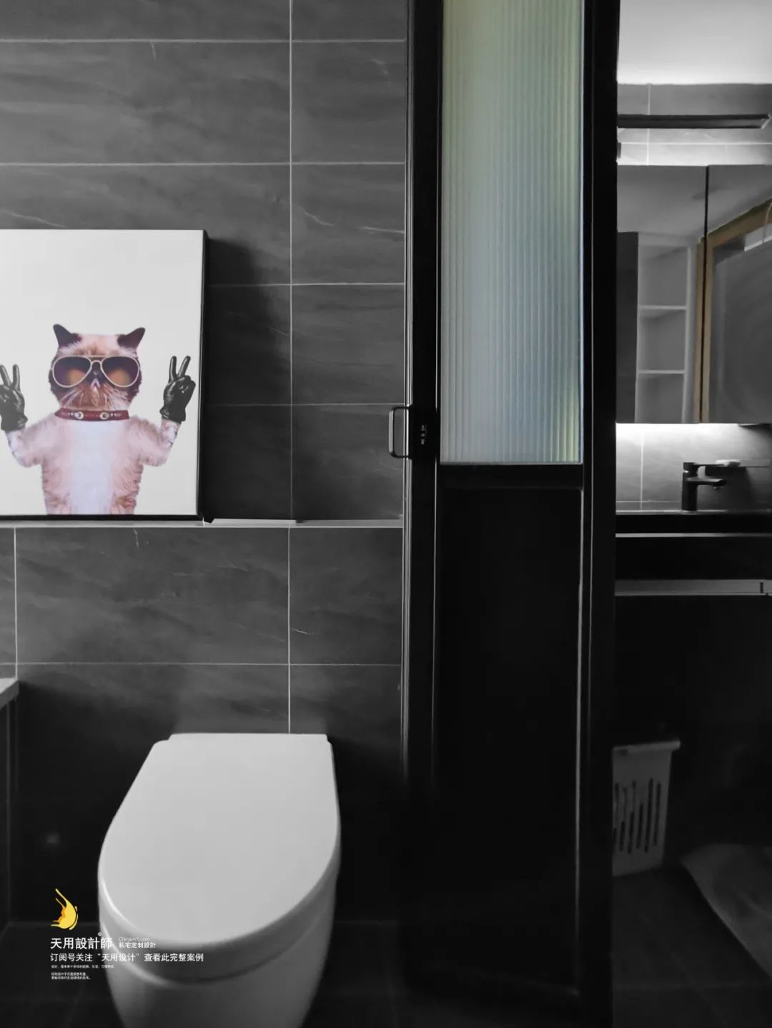
The two bathrooms have a dry and wet separation layout, and the public bathroom has a three-separation design to meet the needs of family members to wash at the same time during peak periods. Due to size restrictions, the toilet area is separated by folding doors. The arrangement of Changhong glass weakens the impact of closing the door on the public bathroom light.