
Project information
Design | Design: Tianyong Design
Customized | Fixed furniture:Tiangongfang Manufacturing
Address | Address: Poly Xinyu
Style | Style: modern, low-key and exquisite luxury style
Area | Area: 107 m²
Photography | Film: Star
The owner’s design needs are: mainly simple and warm, not limited to simple, modern, Nordic and other styles; he likes elements such as wireframe walls and lattice glass; he hopes to effectively improve space utilization; he hopes to have sufficient storage space.
Like many ordinary secondary renovations, the house decoration style is old, with a lot of clutter and mess. Renovation of second-hand houses is about reducing complexity to simplicity. It is about finding out the thoughts of life in the midst of hustle and bustle, putting down old and redundant things, focusing on the main line, constantly enriching the ideals and pursuits of life, feeling life, and loving life.
We look forward to the results every time. No matter what, life is not just as simple as owning a home, but being in it and creating more happiness for the family.
Renovation is actually a re-examination and reflection on life. We never design for the sake of design, but discover ourselves, understand ourselves, and meet new life with a new state in the process of design.

Before design

The design team used a large number of light-colored materials to create a bright and simple interior space, presenting a new home that is completely different from the original state. Don’t create an overly exaggerated sense of expression or design, just create a living experience that can stand the test of time.

Graphic Design

Floor Layout

Schematic diagram of wall demolition
The original floor plan was reasonably planned, so during the renovation process, the design team mainly optimized the living experience by changing details, arranging storage locations based on the residents’ living habits, and improving space utilization.
White ceramic tiles are used as the base in the public areas to enhance the brightness of the space; wooden floors are used in the bedroom areas to create a warm and comfortable sleeping space.

Living Room
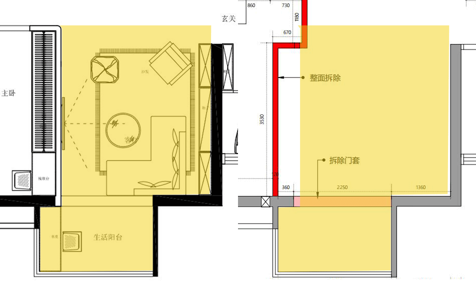
The width of the living room is sufficient. Remove the wall between the living room and the master bedroom, and re-plan it so that part of the area can be used as a wardrobe for the master bedroom to achieve a win-win design for the living room and bedroom. The living balcony is wrapped into the living room, and the two form a natural extension, making the indoor space feel comfortable.
Place a corner sofa with a single chair in the living room space, which is free and flexible; the cabinet behind the sofa adds more storage functions.

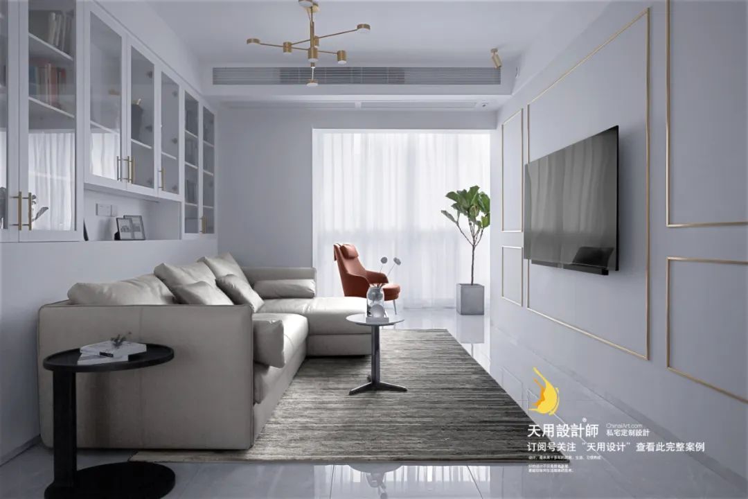
When the lighting source remains unchanged, light colors are used as the main color in the living room to make the home look bright and spacious. The storage cabinet behind the sofa is mainly used as a bookshelf. The transparent glass cabinet door makes it easy to access books; the lower part is used to store rarely used items. The
Tianyong Design team decomposes and combines various elements that the owners like, and integrates them well into the home space. For example, the sense of lines, sofas, bookcases, TV background walls, etc. all echo one by one to ensure the harmony of the space.

The eye-catching orange single chair is paired with natural and simple large green plants. Sunlight flows into the room through the white gauze curtain, creating a comfortable and peaceful balcony leisure space.

Restaurant
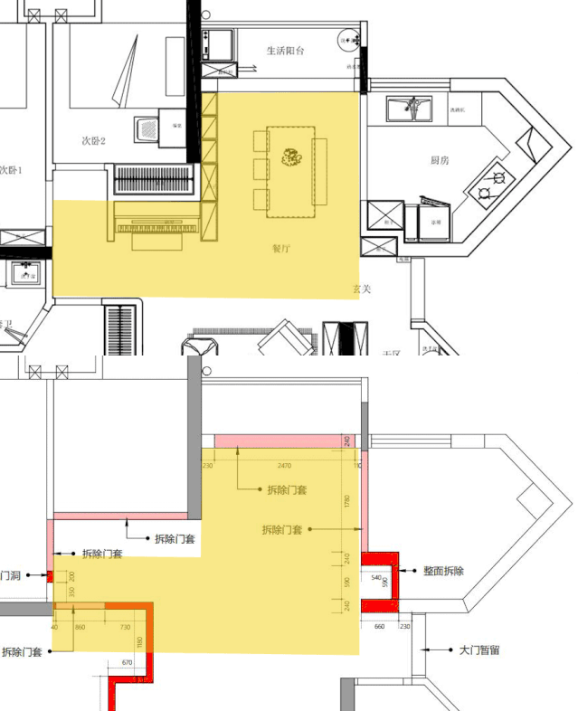
The dining room and piano area make full use of the space given by the corridor and the master bedroom. Different functional areas are well integrated, and the movement lines are smoother, making the space more integrated.
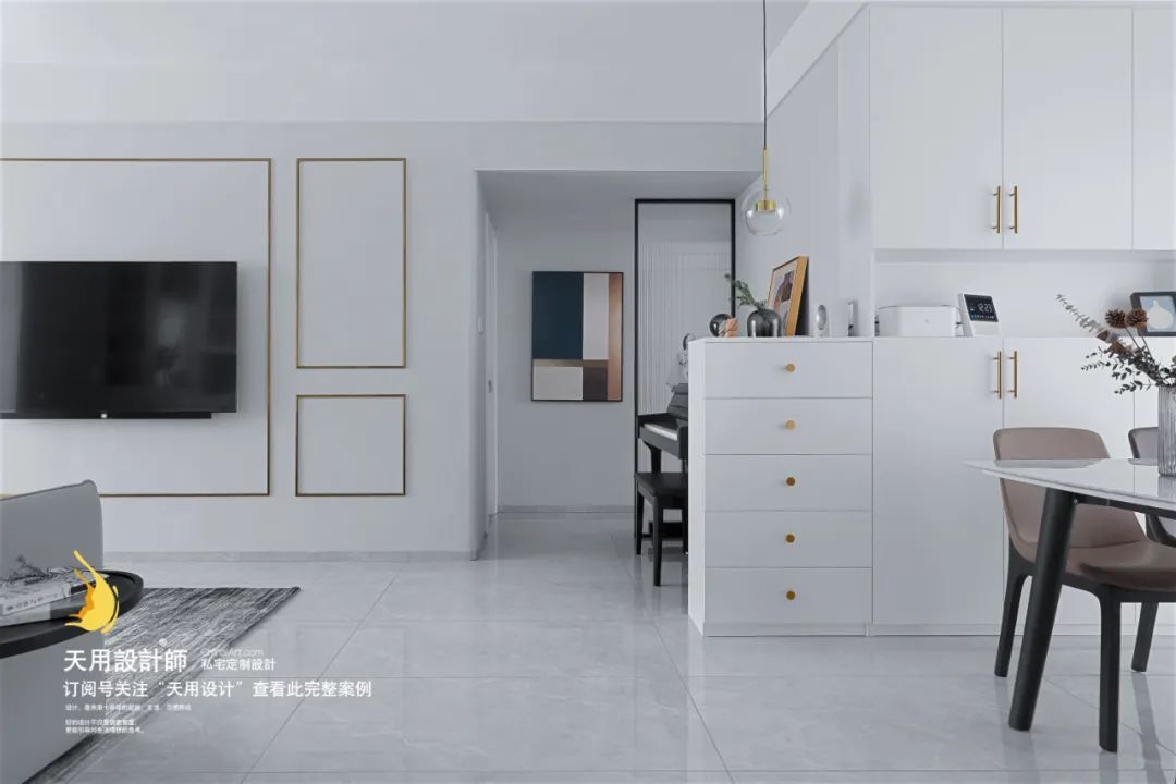
Looking in from the entrance, the living room and dining room are separated on two sides, echoing each other with exquisite and detailed golden elements.
The hanging painting elements at the end of the corridor fit in with the various elements of the space. The Changhong glass in front separates the piano position and avoids the awkwardness of looking directly at the door from the entrance.
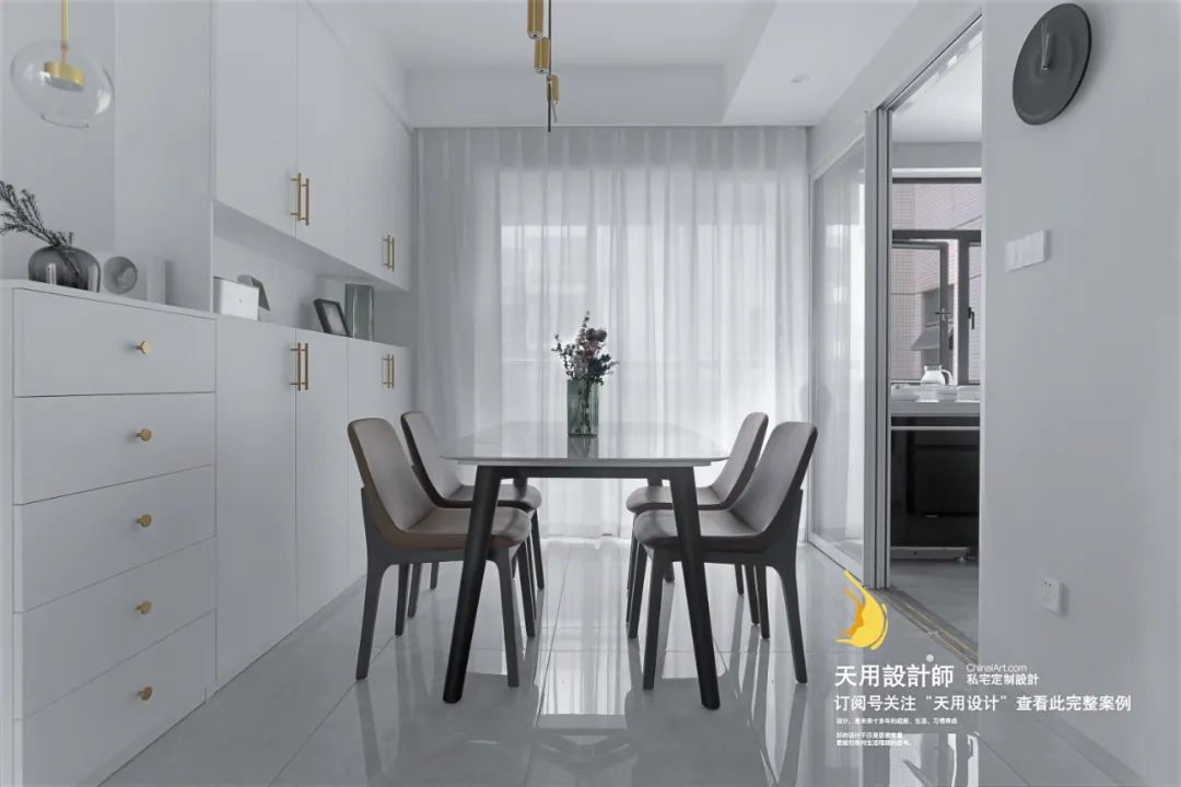
The restaurant uses the combination of light and white to outline a hazy sense of transparency. It also chooses heavier dining tables and chairs to make the overall space light but stable, in line with the living habits of three generations living together.

The design of the sideboard fully considers the actual needs of the residents, choosing a large number of closed designs that are convenient for cleaning, leaving space in the middle for convenient storage; and the half-height drawer cabinet is not to block the lighting and sight of the piano area.


Use the cabinet and Changhong glass to cleverly create a recessed area to serve as the piano area, reducing the possibility of mixing with other functional spaces and creating a good sense of spatial ritual for piano practice.

Kitchen

Remove the "ɔ" shaped wall between the kitchen and dining room, and divide the small area into two parts, which are made into entrance cabinets and high cabinets in the kitchen to make up for the defect of no shoe cabinets in the entrance.

The kitchen uses a transparent glass sliding door to ensure the connection between the kitchen and the dining room while making it a closed kitchen.

Bathroom

The public bathroom area is quite large. After the sink is removed, storage areas are added on both sides to store toiletries and sanitary products nearby.

The master bathroom moved the sink outside and added a floor-to-ceiling locker to facilitate the storage of toiletries. The bottom of the cabinet is supported at a sufficient height to avoid water intrusion. Changhong doors and glass partitions make the bathroom more transparent and open, and will not cause a sense of oppression when used.

Master bedroom
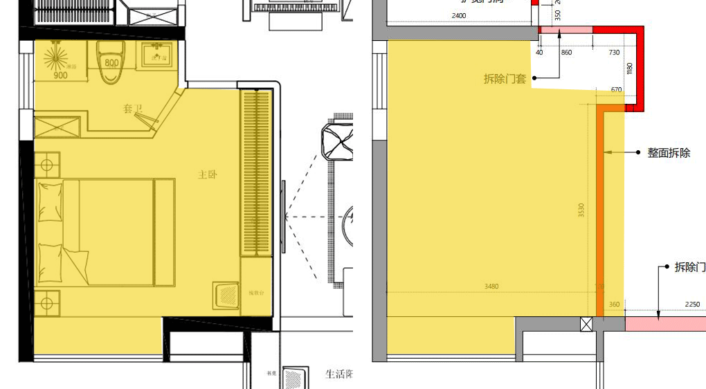
The previous owner changed the main bathroom to other uses. The designer re-planned the main bathroom based on the actual design of this house. The main bathroom door is made into a bevel to prevent the bathroom from being too sharp and sharp, making the viewing angle into the door larger and smoother.


The master bedroom is decorated based on the elements of hanging paintings. The large area of white and gray wood color serves as the keynote, making it a relaxing resting space; the low-key, exquisite, luxurious and simple lines and lamps, embellished with blue curtains, make the master bedroom jump out of the monotony, and well show the owner's interesting personality and life taste.


Children’s Room

In the second bedroom 1, the storage cabinet is first designed according to the width of the door stack, and then guided by an incline to increase the width and arrange the wardrobe to meet the storage needs.
Second bedroom 2 uses the area vacated by the corridor and the master bedroom to build a new wall and embed a suitable wardrobe. At the same time, partitions and half cabinets are used to form a recessed area on the outside to serve as a piano area, and avoid facing the door directly when entering.
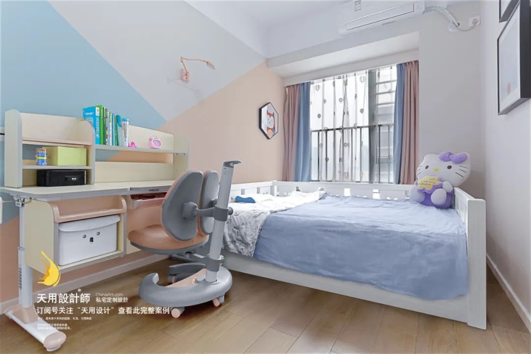
Due to the long residence time, the design team reserved enough room for changes for the children’s growth needs. At this stage, children's rooms are full of childlike fun, and the color of the wall paint corresponds to the interior furniture and decorative furnishings.