

House information
Design | Design: Tianyong Design
Address | Address: Guangzhou Everbright Garden
Area | Area: 116 m²
Style | Style: Nordic Japanese style
Photography | Film: Da Fang
▶ Keywords for this set of cases: design comparison, house type changes, storage layout
Owners should have been paying attention to us for a long time. Many of the reference cases in the questionnaire are our past real-life cases.

The owner of this residential project is a combination of a teacher and a lawyer, a combination of sensibility and rationality. Unlike ordinary families, the male owner is more involved in the design process, and a variety of inspirations collide to create a warm and beautiful home. The design team communicated with the very well-matched owner couple, and it was very sweet and the taste of happiness.
Brightness, comfort and grandeur are the basic requirements of style. Because three generations of family members will live together in a few years, there will be more needs expressed for storage, cleaning and communication.
For colors and materials, we choose neutral and warm woods that are peaceful and comfortable; we also choose furniture that is more flexible and can be used for multiple purposes. In addition to the large wardrobes in each room, there are also cabinets with sufficient storage in the public areas.
This residential design compares the renderings and the actual pictures one by one to demonstrate our control in all aspects. Every time a set of designs comes to life and you move in, there is a feeling that lingers in your heart. I am very happy to be a part of the wonderful life builders.



The owner’s color palette for the entire residence is wood and white, creating a warm, comfortable and livable atmosphere. The living room and dining room are covered with wooden floors and are connected as a whole. The warm wooden floors are arranged in order, warm and delicate; the white cabinets and walls extend the visual effect, making it warm and bright.
For space color matching, we use orange and blue in aesthetics as contrasting colors. In a large area of warm colors, different shades of blue are used as cool embellishments to make the overall space not too boring and have a sense of surprise.
one
House type renovation analysis
The original house plan is relatively perfect for the needs of the owner’s family of this residential project, and the layout planning of each place is also very reasonable. The designer mainly adjusts and improves small areas to make the living process of the residents smoother, the circulation lines more rounded, and the space to be better utilized.
1. The original entrance hall was short and narrow, and the shoe cabinet took up little space. It was too cramped as a connection between the inside and outside of the home. After the renovation, the shoe cabinet space was expanded, and hollow screens and hexagonal tiles were used to redivide the entrance space, making it appear grand and natural.
2. On the premise of meeting the needs of use, the space in the public bathroom area is compressed and made into cabinets in the restaurant and a cooking table in the kitchen.
3. Incorporate part of the balcony into the room to create an indoor small study. Excellent location and excellent lighting.
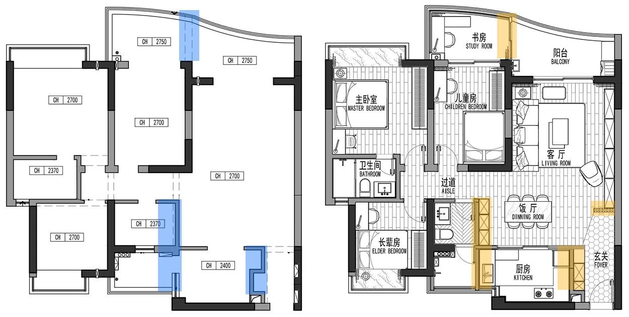
(Details transformation comparison picture)
Two
Storage layout analysis
For owners, storage is a point that cannot be ignored in design.
The storage cabinets are evenly distributed throughout, which is not only convenient for the owners to use, but also has a good impact on the overall visual effect. We adopt the principle of proximity in use and storage to reduce the occurrence of movement lines; the cabinets of the same series are harmonious and unified, and the pure white color reduces the sense of oppression and provides a superior sense of space.
The cabinets in public areas adhere to the "28 principle", revealing: hiding = 2:8. The exposed part is convenient for storing items and decorations, while the hidden area is used for placing other less beautiful or messy items. Only by hiding 80% of the chaos can you show 20% of the beauty.

(Storage distribution map)
Entrance


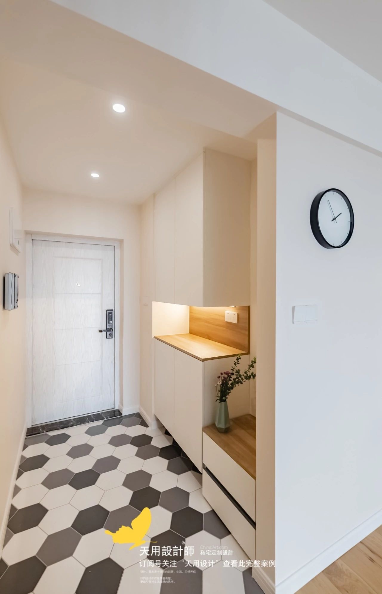
The entrance is simple and clear, and the irregular paving of hexagonal tiles looks unique and interesting. The shoe cabinet has a huge storage capacity, and the pure white color also broadens the visual effect. The middle part is left empty for easy storage, and the bottom part can reduce the steps of opening and closing the cabinet door. There is a light on the cabinet so that you don't have to turn on the big light in the living room as soon as you enter the door.
On the right is a shoe changing stool + a child’s exclusive shoe cabinet. In the parent-child relationship, sometimes it is necessary to maintain an appropriate sense of distance to allow children to have their own private space.

The entrance hall and the living room are connected with each other using different materials, and a wooden screen is used to block the direct view of the living room. Large green plants bring fresh greenery and make it more life-like.
Living room

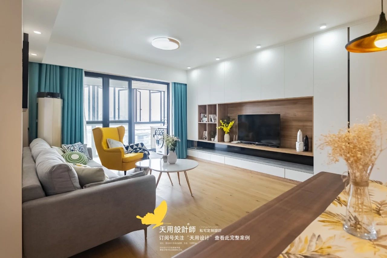
The TV cabinet style has a considerable storage capacity. The closed design makes it easier to take care of. A small part of the open compartment is convenient for storage and can also be used as a display cabinet to show your personality. The minimalist style of wood and white is consistent with the overall style, beautiful and elegant.
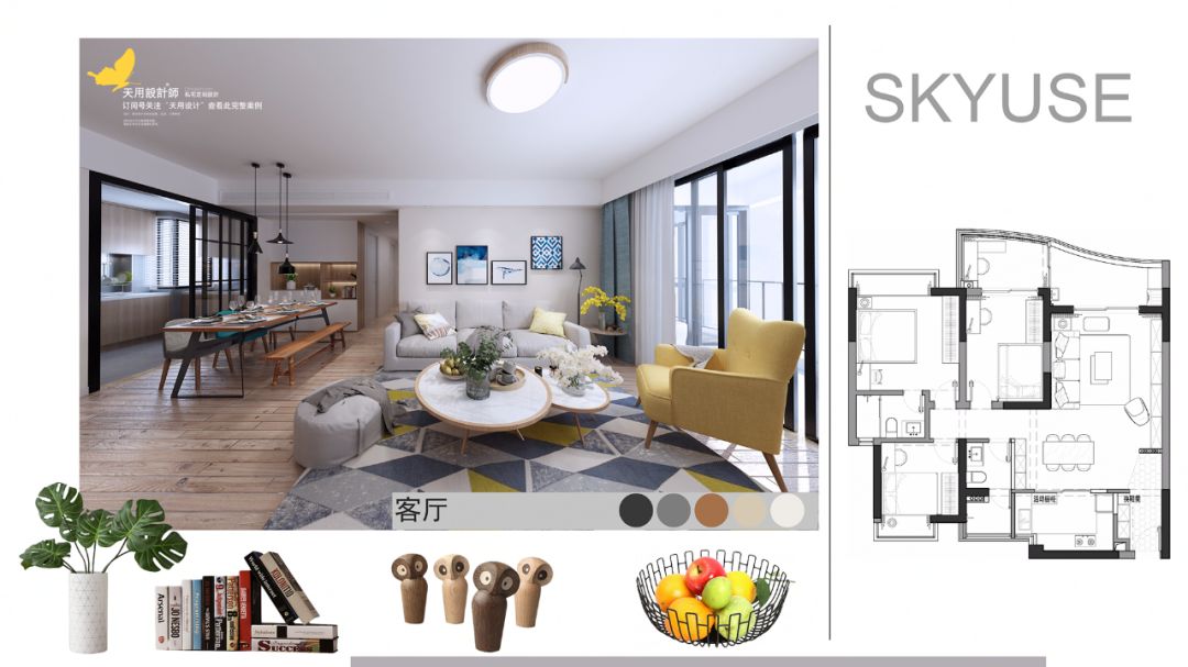


Choose a soft gray fabric sofa in the living room, paired with clear blue hanging paintings, like a fresh sea breeze in warm spring.
When we select multiple hanging paintings, we must consider the unity of the elements. The simplest way is style + color. For example, this residential design project is all simple and blue. The former Hong Kong-style case is the Yixue style + yellow embellishment, which is more flexible.


The white dining table with thin legs and metal texture, paired with small flowers, is full of literary and artistic feeling. The single chair is in an "eye-catching" bright yellow color and is very comfortable.
Indoor furniture and decorative furnishings are generally selected based on two aspects, one is comfort, and the other is aesthetics. Life must have a sense of ritual, and the sense of ritual comes from exquisite objects or special life experiences.
Restaurant


The restaurant is composed of wooden dining tables, chairs and sideboards full of texture. The brown wood has deep imprints of time, the lines are smooth and natural, and the feel is perfect; the combination of one long and two short dining chairs is flexible and not rigid. The style of the sideboard is consistent with other cabinets, and small spaces are separated according to needs to facilitate the classification of items.
The warm yellow light shines on the food cooked by the family, adding a layer of happy deliciousness.

Lighting is an indispensable and important part of life activities that cannot be ignored. Looking from the kitchen to the balcony, the designer chose diffused soft and warm light. The lighting and materials cooperate with each other, allowing air and light to flow naturally, with clear layers and harmony.
Kitchen
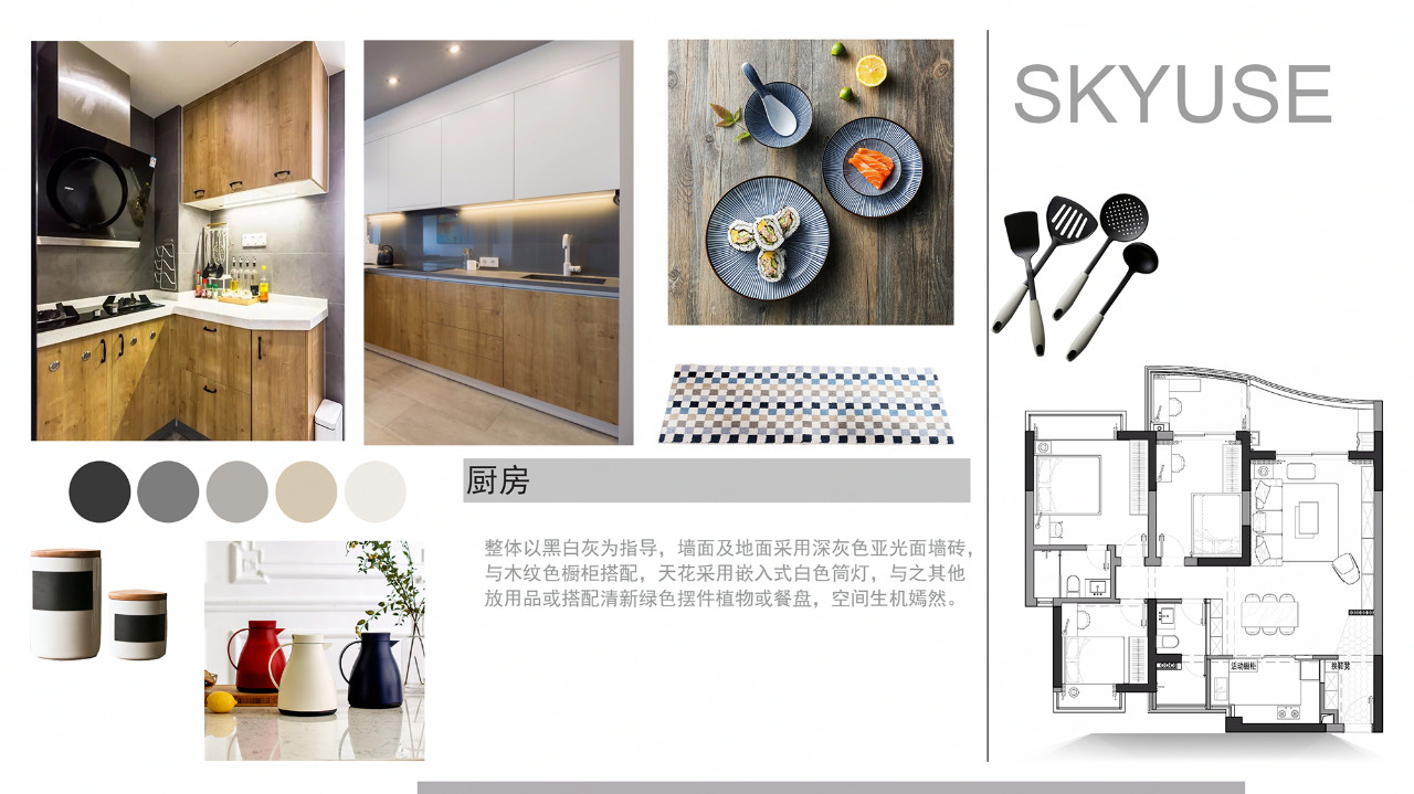

The kitchen is designed in a "U" shape with a wide work surface, making it convenient for multiple people to use it at the same time. Light gray tiles have a natural texture, are stain-resistant and have little impact on lighting.
Corridor
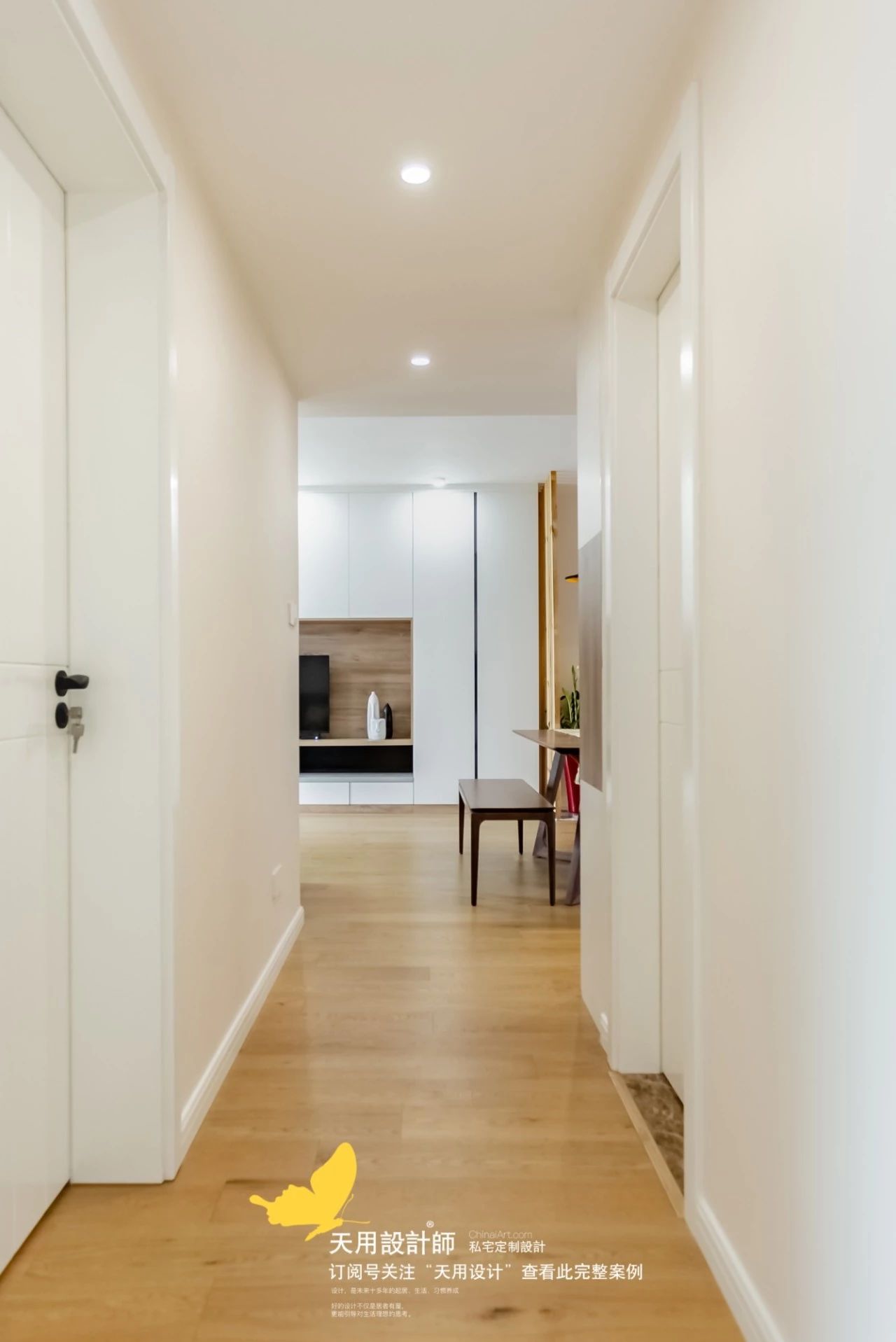
The corridor continues the style of the living room and dining room, and the pure white door is hidden in the wall, reducing the sense of visual cutting.
Master bedroom


The master bedroom is in light colors, with soft light gray bedding and light-colored wooden floors, creating a gentle and soothing atmosphere that makes the residents feel calm and relaxed. Plant hanging paintings add some liveliness, increasing the comfort of the space and the interest of life.
Second bedroom
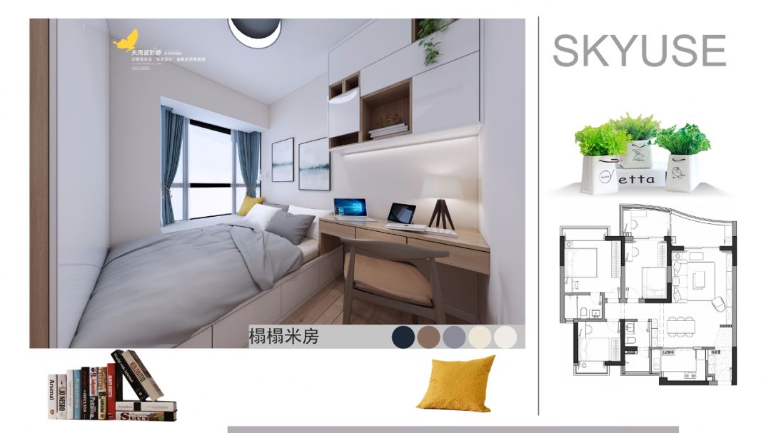


In addition to meeting basic sleeping needs, the tatami room also has a desk and corresponding wardrobe, making it convenient for family and friends to stay. The pure white wall cabinet above the desk is hidden in the wall, reducing the sense of oppression.
Children’s Room


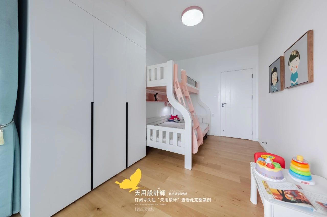
The girl’s room is in light pink, with bunk beds and an oversized wardrobe, which is enough to satisfy the little princess’s beautiful wishes. The hanging paintings and small toy space full of childishness are cute and warm.
Wrap half of the balcony into the children’s room to create a study area. An independent study area helps to cultivate a sense of ritual and consciousness, and is conducive to entering a learning state. Minimalist layout reduces the potential for distraction.
Bathroom


The public bathroom has a two-separated layout. The walls are paved with white bricks and black joints, and the floors use different tiling methods. Use cloth curtains as partitions to save space and facilitate replacement and cleaning; leave a small storage area for toiletries in the shower area.
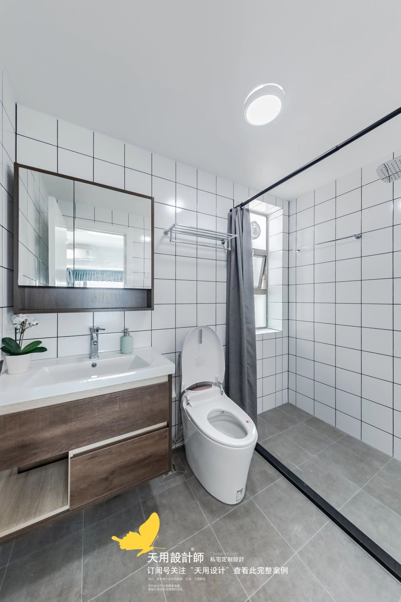
The layout style of the main guard and the public guard are roughly the same, so I won’t go into details~
House plan
Housing information
Design | Design: Tianyong Design
Address | Address: Guangzhou Everbright Garden
Area | Area: 116 m²
Style | Style: Nordic Japanese style
Photography | Film: Da Fang
